What is Good UI/UX? Jakob Nielsen's 10 Usability Heuristics

"What makes UI/UX 'good'?"
If you're a designer or developer, you've heard this question a thousand times. While answers like "beautiful," "flashy," or "trendy" might come to mind, the fundamental criterion is 'Usability'.
How easily and intuitively can a user interact with your system? To answer this, Jakob Nielsen proposed 10 Usability Heuristics in 1994. Even 30 years later, these remain the most powerful guidelines in interaction design.
At SiteSnapshot, we want to help build a better web, so let's break down these 10 principles one by one.
1. Visibility of System Status
"The design should always keep users informed about what is going on, through appropriate feedback within a reasonable amount of time."
Users need to know if their request is being processed or how much download time is left. Without feedback, users feel anxious and may leave.

- Good Example: A progress bar during file uploads, button color change on click.
- Bad Example: A payment screen that freezes with no indication after clicking 'Pay'.
2. Match Between System and the Real World
"The design should speak the users' language. Use words, phrases, and concepts familiar to the user, rather than internal jargon."
Avoid "system-oriented" terms. If digital icons resemble real-world objects, users can intuitively understand their function without learning them first.
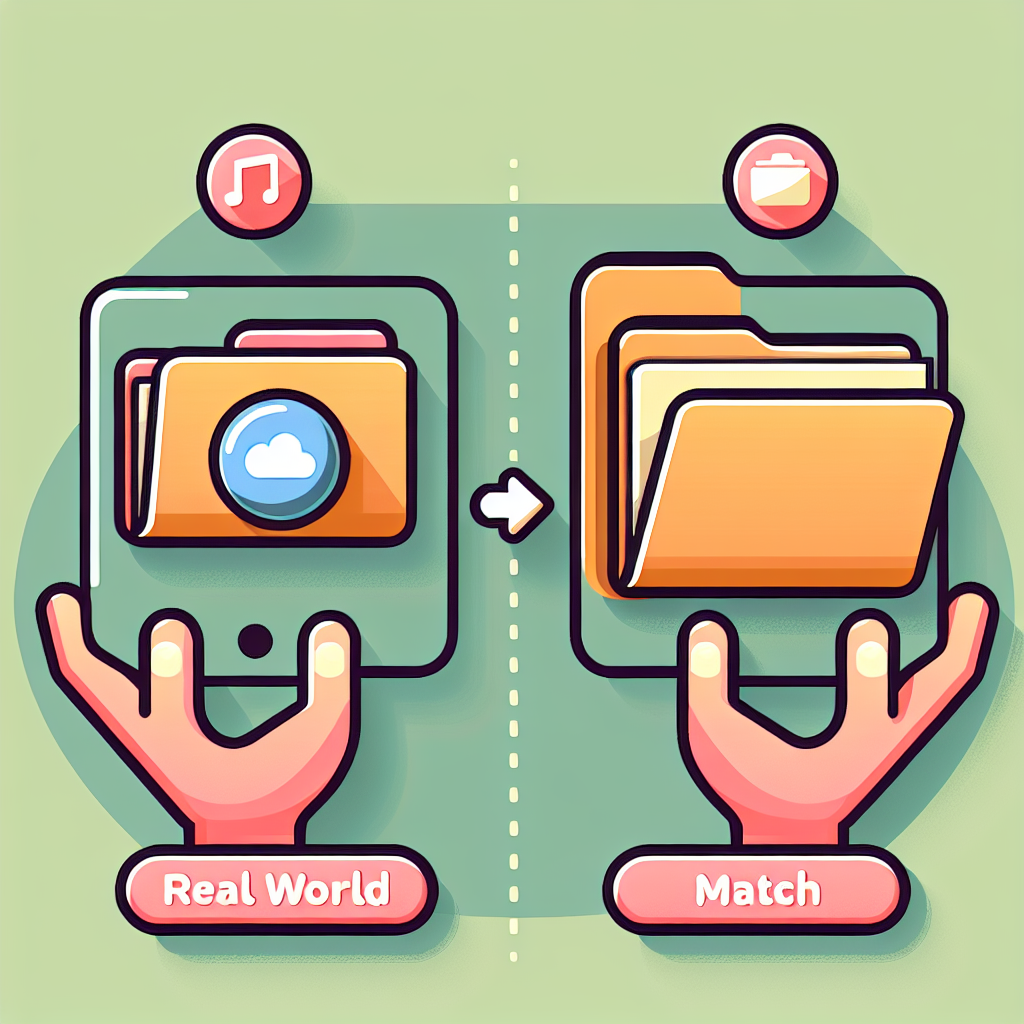
- Good Example: 'Trash can' icon (delete), 'Magnifying glass' (search), 'Folder' (organize).
- Bad Example: Displaying error codes like 'Error 0x00004' that only developers understand.
3. User Control and Freedom
"Users often perform actions by mistake. They need a clearly marked 'emergency exit' to leave the unwanted action without having to go through an extended process."
Users make mistakes. They click the wrong button or delete the wrong file. The system must provide an easy way out.
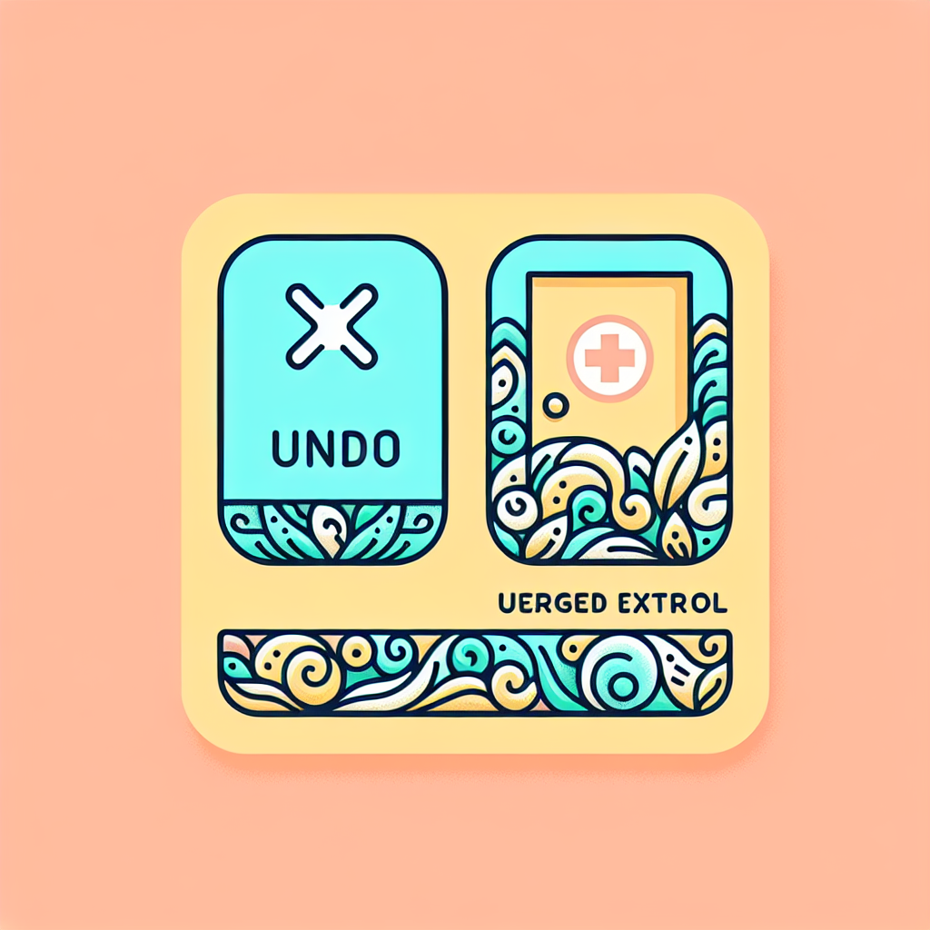
- Good Example: 'Undo' and 'Redo' functionality, a clear 'X' (close) button on popups.
- Bad Example: Hiding the 'Delete Account' option or settings that are irreversible once clicked.
4. Consistency and Standards
"Users should not have to wonder whether different words, situations, or actions mean the same thing. Follow platform conventions."
The web has established standards. Links are blue or underlined; clicking a logo takes you home. Breaking these conventions confuses users.
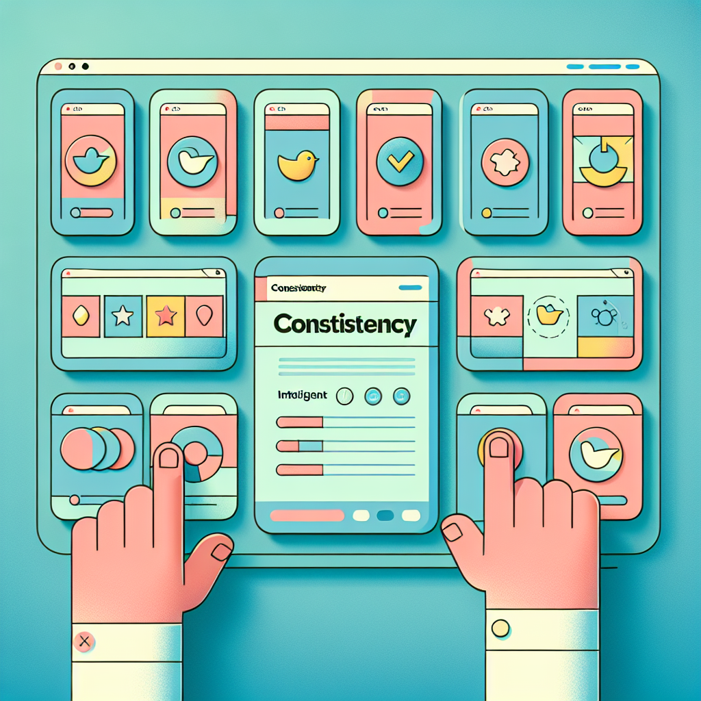
- Good Example: Keeping all 'Submit' buttons the same color and style across the site.
- Bad Example: Using 'Submit', 'Send', and 'Go' interchangeably for the same action on different pages.
5. Error Prevention
"Good error messages are important, but the best designs carefully prevent problems from occurring in the first place."
Eliminating error-prone conditions is better than reporting errors. Ask for confirmation before critical actions or constrain input formats.
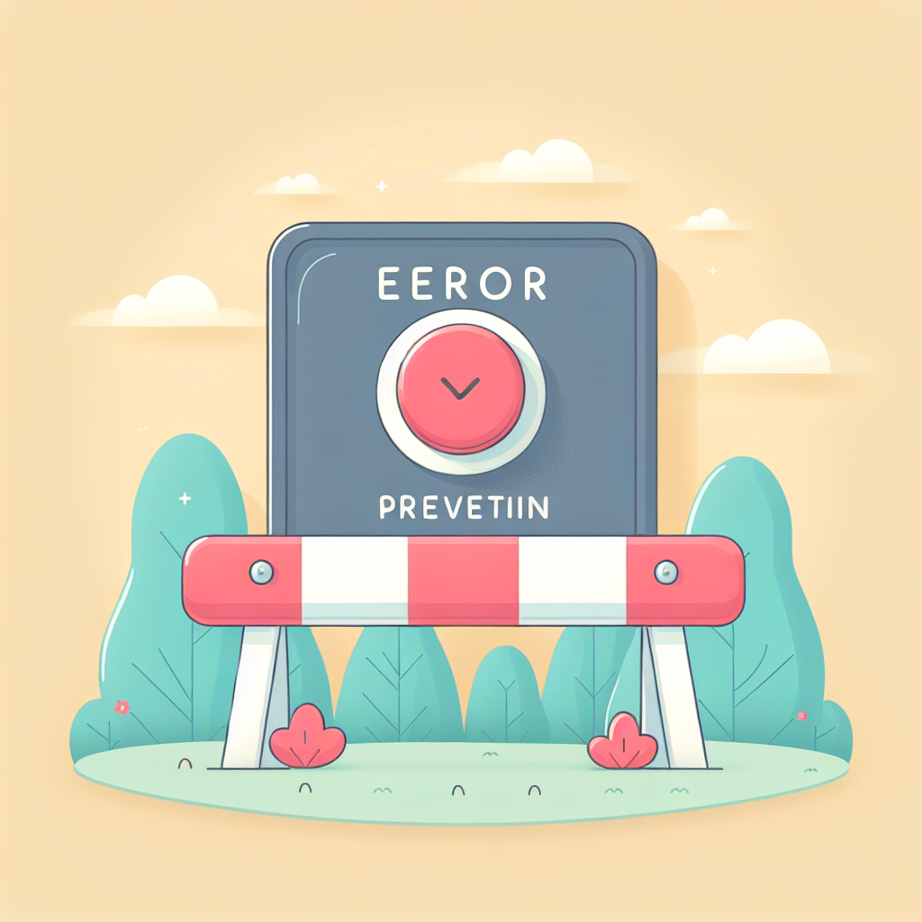
- Good Example: Search autocomplete (prevents typos), 'Are you sure?' confirmation dialogs, date pickers that disable past dates.
- Bad Example: Allowing alphabetic characters in a phone number input field.
6. Recognition Rather Than Recall
"Minimize the user's memory load by making elements, actions, and options visible. The user should not have to remember information from one part of the interface to another."
Human short-term memory is limited. Don't make users memorize information from a previous screen to use it on the current one. Keep necessary information visible.
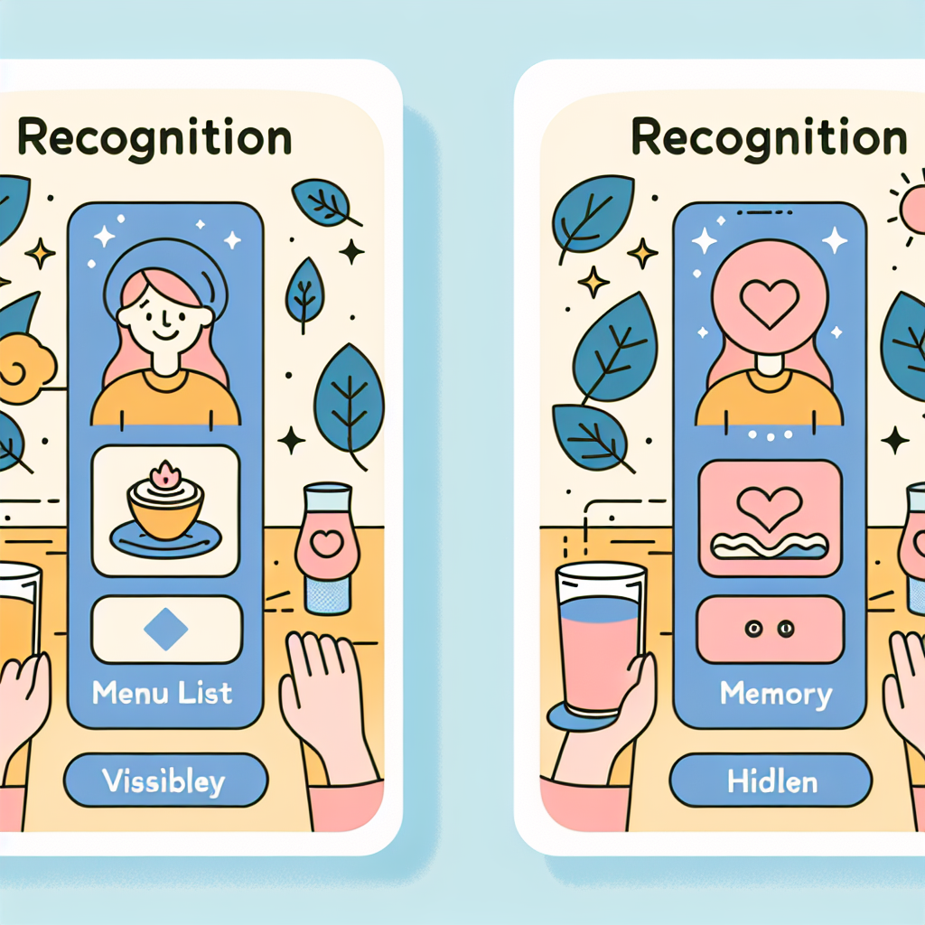
- Good Example: Displaying 'Recently Viewed' items, visible menu options.
- Bad Example: CLI (Command Line Interface) environments where you must memorize commands.
7. Flexibility and Efficiency of Use
"Shortcuts — hidden from novice users — may speed up the interaction for the expert user so that the design can cater to both inexperienced and experienced users."
Systems should be accessible to everyone but efficient for experts. These efficiency tools are often called 'accelerators'.

- Good Example: Keyboard shortcuts (Ctrl+C, Ctrl+V), 'Advanced Settings' toggles.
- Bad Example: Workflows that require navigating through multiple nested menus with the mouse every single time.
8. Aesthetic and Minimalist Design
"Interfaces should not contain information which is irrelevant or rarely needed. Every extra unit of information in an interface competes with the relevant units of information."
Minimalism isn't just about looking good; it's about prioritizing content. Decoration shouldn't distract from the core message.

- Good Example: The Google search homepage. pure focus on the search bar.
- Bad Example: News sites cluttered with banner ads and popups, making the article hard to find.
9. Help Users Recognize, Diagnose, and Recover from Errors
"Error messages should be expressed in plain language (no codes), precisely indicate the problem, and constructively suggest a solution."
Simply saying "An error occurred" is rude. explain what went wrong and how to fix it.
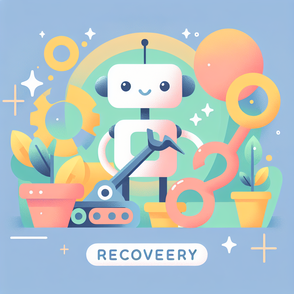
- Good Example: "No internet connection. Please check your Wi-Fi settings."
- Bad Example: "Error 404", "Unknown Error"
10. Help and Documentation
"It’s best if the system doesn’t need any additional explanation. However, it may be necessary to provide documentation to help users understand how to complete their tasks."
Even the most intuitive systems can stump users. Help should be easy to find when needed.

- Good Example: Searchable help centers, tooltips on hover, onboarding tutorials.
- Bad Example: A system with absolutely no documentation or help button.
Conclusion
These 10 heuristics aren't just "nice-to-haves"—they are the minimum safety nets to keep users from leaving your site.
How is your service doing? Is the system status visible? Are error messages helpful? If you're missing anything, use SiteSnapshot's visual monitoring to catch unintended UI breaks and errors. Good UX starts with consistent care.